Developing my personal website
I’m a junior software developer in Chester, UK, and my personal site is www.DuncanRitchie.co.uk. I created it in 2019 and redesigned it the following year.
This article was adapted from the readme file for the site repository on GitHub. It explains the site’s current architecture and the history of the site.
Assets
This is a static site with three HTML pages: index.html, code.html, and aboutme.html. For three pages, there’s quite a lot going on.
It is hosted by Netlify. Other repos of mine are published to subfolders, eg www.DuncanRitchie.co.uk/calculator/ and www.DuncanRitchie.co.uk/snake/.
The font is Alegreya, self-hosted. I’m also self-hosting the logos of GitHub and LinkedIn as SVGs, which are from Font Awesome.
The little downward arrowhead used on the navbar is an SVG I made in Inkscape and minified. Actually, for Internet Explorer it’s two SVGs — a green version appears on mouse (h)over — but modern browsers can change the colour with CSS.
Images are hosted by Cloudinary, and I’m making use of its facility for serving pictures with different sizes and formats (WebP/Jpeg for photos, WebP/PNG for screenshots).
All the photos accompanying the sections were taken by me, except the photo of me, which was taken by my mum.
My favicon is the head of a fulmar, the North Atlantic seabird. The background of my Latin vocabulary website velut and the avatars of my two GitHub accounts (1 and 2) are derived from the same photo, which I took while at uni in Scotland.
Creating the site
I started pursuing a career in web/software development by enrolling on a 12-week course at a bootcamp called Code Nation, which luckily for me had just opened up their second campus in my home city.
Three weeks in (18th Feb 2019), we students started creating portfolio websites with what basics we had learnt about HTML, CSS, JavaScript, and Git. We had been introduced to the CSS library Bootstrap, so my first commit is just “Hello, world!” with all of Bootstrap imported. I removed all the Bootstrap BS the next day when I realised I didn’t have to host it myself.
So I got the site into a vaguely decent shape and made sure it was responsive to different screen sizes and accessible to keyboard-users.
The use of Bootstrap was most obvious from the markup of the navigation bar and from the use of the word “jumbotron” for a full-width <div> containing paragraphs.
My repo used to be www.github.com/DuncanRitchie/portfolio, which was live at www.DuncanRitchie.co.uk/Portfolio/, before I realised that I could get root hosting by moving it to a repo with the same name as my github.io address. Pretty basic stuff, but all new to me!
I continued adding projects to code.html, commenting out less interesting projects, changing wording, and improving the CSS. This went on after I graduated from the bootcamp, secured an apprenticeship, went back to the bootcamp for my training part of the apprenticeship, graduated again, and started proper work for my employer Information Catalyst. Eventually the thought occurred to me (no earlier than September 2019) that a visitor should be able to print my site to paper; I’m not sure who would want to, but I implemented the styles. And I had a brief flirt with using scroll-snapping, but found that the entire viewport yanking from section to section wasn’t the best user experience.
Why I redesigned my site
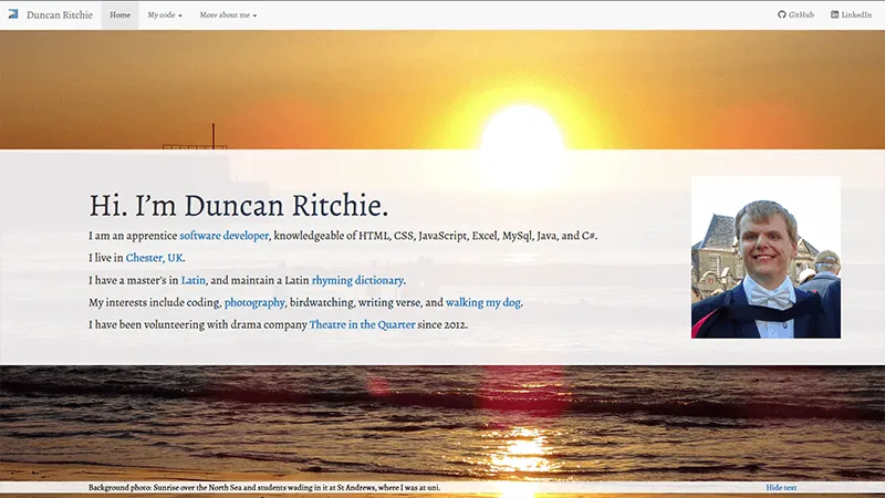
I wasn’t entirely satisfied with my site. I had four quibbles remaining.
My design had the afore-mentioned jumbotrons splayed out in front of full-width background photos, with a button to hide or show the jumbotrons to reveal the photos better. This was reasonably good, but I disliked not being able to see both the photo and the text at the same time.
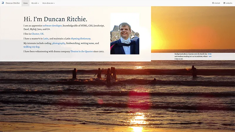
A bigger problem for the aesthetics was that Internet Explorer does not handle Flexbox very well, which messed up the site’s layout. (See the screenshot below. Urgh. And yes, I know polyfills exist, but that’s boring.)
My site was using Bootstrap, which is a perfectly decent library, I’m not criticizing it. As a newbie, I appreciated being able to create an accessible, responsive, professional-looking navbar without much learning, and I liked having some model code showing me things like Aria roles and screenreader-only classes. But I felt I should break away from Bootstrap, and be less reliant on external styling. A site with three pages can do without so large a dependency. I can surely manage to make my own navbar!
The last and probably the least of my quibbles was that I had a photo of myself on the homepage, which only displayed on screens wider than 767 pixels because I had never figured out how to make it look decent on mobile.
Cropping it would cut much of my face off; keeping the aspect ratio would make the picture take up most of the screen, and I don’t think visitors really want my face taking up so much of their screen.
So @media (max-width:767px) { .jumbotron-image { display: none;} } it was!
Yes, I could have just swapped the photo out for one that could be cropped better. Yes, images can be floated to not cause gaps in the layout. But by the beginning of 2020, I had bigger visions. I was going to revamp the whole site.
The 2020 redesign
Inspiration and how I started
My process for designing the look of my Latin vocabulary site, back in May 2019, was to open Inkscape, set the page dimensions to the size of a phone, and use my photo of the flying fulmar for the background and decide on a colour-scheme based off it. The sky of the photo got replaced with a paler blue gradient, and text was overlayed, with the placement of the fulmar being adjusted away from the title text.
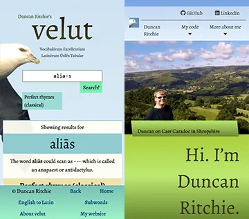
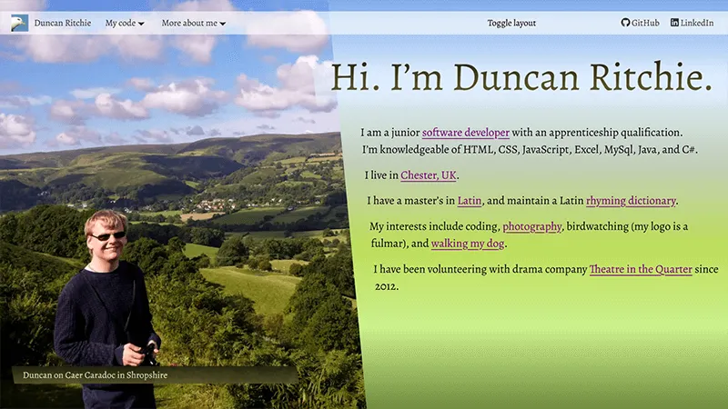
In a similar way, my redesign of www.DuncanRitchie.co.uk started with me choosing a photo of myself, importing it to Inkscape, then basing the colour scheme off it, with a gradient background to extend the colours from the photo. Some of the colours, for instance on headings, are similar to those used on my Latin site. I solved the issue of me wanting to see the photo and text together (on desktop) by having the photo take up the left side of the screen and putting the text on the right. To make the photo look more connected to the text, I settled on a diagonal dividing line between them.
Considerations about different pages
On aboutme.html, there are several sections, with a photo for each.
On wide enough screens, the photos (class="main-image") are fixed in position to the viewport, so they all take up the left side of the screen; the Intersection Observer API is used in the JavaScript to control which image is visible, by watching for section headings to come into or out of view.
A CSS transition on the clip-path property makes the effect look less jarring.
The photos, however, do not affect the layout of the text — their fixed position puts them outside of the document flow.
To make the text fit against the diagonal edge, even when the page is scrolled, I needed an empty <div> in the HTML (id="text-wrap-guide"), with appropriate width, height, and shape-outside properties.
JavaScript is used to make the values change when the viewport is scrolled or resized.
A CSS transition on shape-outside makes the text move more smoothly.
On code.html, my showcase of projects meant that I couldn’t have the diagonal layout: I want the showcase to take up the width of the screen, instead of being squashed into the right side. I’ve therefore made a more rectangular layout with narrower photos; the photos are less relevant to the page anyway.
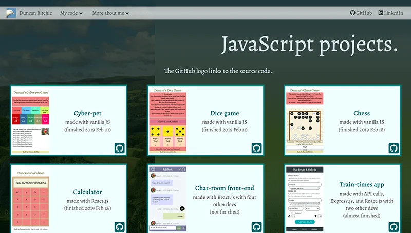
I then applied the “rectangular” layout to the other two pages, and added a button in the navbar to toggle between the two layouts (rectangular/diagonal). Local Storage is used to remember which layout you want.
Accessibility
Accessibility is something I’ve improved in several ways.
- I’ve increased the font sizes.
- Text is no longer on top of pictures, except for the headings, which now have a background gradient (and the heading text has an outline on supporting browsers).
- All images (except inline icons) are represented by
<img>tags withalttext instead of<div>withbackground-image. - On desktop, all elements are ordered in the HTML — and therefore in the tab-order — in the order displayed on screen. (On mobile, the GitHub/LinkedIn links in the navbar create the one exception to this.)
- Screenreader-only text appears next to the GitHub icons on my project showcase.
- The navigation menus can be toggled even if you have neither a mouse nor JavaScript.
This is achieved through the “checkbox hack”: where the state of a hidden tickbox determines whether a menu is displayed, and a visible
<label>controls the tickbox. If you have JavaScript (as nearly everyone does), the tickbox is replaced with a<button>with Aria attributes, which is more semantically appropriate. - If the user has enabled the
prefers-reduced-motionsetting in their browser, they do not see transitions or animations by default. However, the new “diagonal” layout (with its on-scroll transitions to reveal photos and to keep the text aligned with the diagonal edge) can still be turned on and off via the “Toggle layout” button.
Screen-size
I’ve improved the site’s responsiveness to screen-size by:
- wrapping
<img>elements in<picture>to specify different-sized images for different-sized screens; - making extensive use of
remunits, with the value of1reminterpolated between 19px at viewport-width 360px and 28px at viewport-width 2400px; and - creating a
gridlayout for the navbar on mobile.
Browser differences
It is also crucial to consider browser differences. I mainly use Firefox in developing this site, but from the start of the redesign process I have also looked at the site in JavaScript-less Internet Explorer, as well as modern versions of Chrome, Edge, and Opera.
Some examples of how I’ve kept the site looking decent across browsers:
- Browsers that don’t support intersection observers can’t do the scrolling effects on the photos and text-wrapping, so on such browsers I’ve made the photos float statically beside the text.
- Browsers that don’t support the WebP image format get Jpeg and PNG fallbacks.
- The downward arrow next to the nav menus changes colour on hover. For modern browsers, this is achieved through CSS masking; but for older browsers (ie, IE) I’m swapping a separate image in.
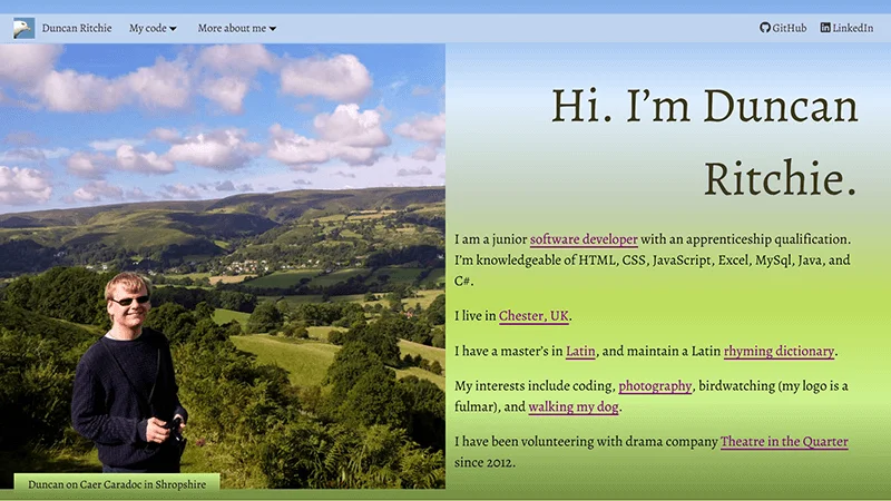
- One of my favourite things about my original site, and it’s true for the redesign too, is that everything appears even if you don’t have JavaScript. In fact, the redesign works better without JavaScript than the original did, because there are no longer any buttons (such as for toggling nav menus) that need the scripting. This is in contrast with all the web projects I’ve showcased on code.html — especially the React work, which doesn’t even display without JavaScript!
Here is a screenshot without JavaScript:
Current state
There are minor improvements remaining to be done.
But overall, I’m delighted with what I’ve made.
It looks good (to me, at least); and I’ve learnt more about HTML, Aria, CSS, and JavaScript: eg, the <picture> tag, rem units, the shape-outside property, @supports queries, intersection observers, Local Storage, and the prefers-reduced-motion setting.
Lighthouse scores
The Lighthouse profiling tool now gives my site 100% scores on Accessibility, SEO, and Best Practices on desktop and mobile on two of the three pages. Performance fluctuates between 83% and 87%. I’m aiming for 100% across Accessibility, Best Practices, and SEO.
My most recent scores are in the table. My old site ranked about the same for performance.
| Page | Device | Performance | Accessibility | Best Practices | SEO |
|---|---|---|---|---|---|
| Home | Mobile | 87 | 100 | 100 | 100 |
| My code | Mobile | 85 | 100 | 92 | 100 |
| More about me | Mobile | 83 | 100 | 100 | 100 |
| Home | Desktop | 85 | 100 | 100 | 100 |
| My code | Desktop | 87 | 100 | 100 | 100 |
| More about me | Desktop | 84 | 100 | 100 | 100 |
Best Practices is below 100% on code.html because I’ve not yet configured Cloudinary to return a Webp for a picture. This is a pretty easy mistake to fix.
Deployments
To see the old design, which I’ve kept on the before-2020-redesign branch, go to old.DuncanRitchie.co.uk.
Since 31st May 2020 the new design has been live at www.DuncanRitchie.co.uk. It is on the main branch.