<col> elements on verb tables
<col> is a HTML element that is used for formatting a column of cells in a table.
You can make a HTML table without it, and I imagine most HTML tables don’t use it.
But it can be helpful in some circumstances.
For your HTML to be valid, any <col> needs to be inside a <colgroup>.
I’ve put a bit more information on <colgroup> on my article listing all HTML tags.
If you want MDN’s documentation, see here: <col>, <colgroup>.
Anyway, this article is about <col>, and how I use it on velut (my Latin website), albeit inside a component that is not yet publicly visible.
I have some tables, and I’m using <col> to make column widths more consistent between tables.
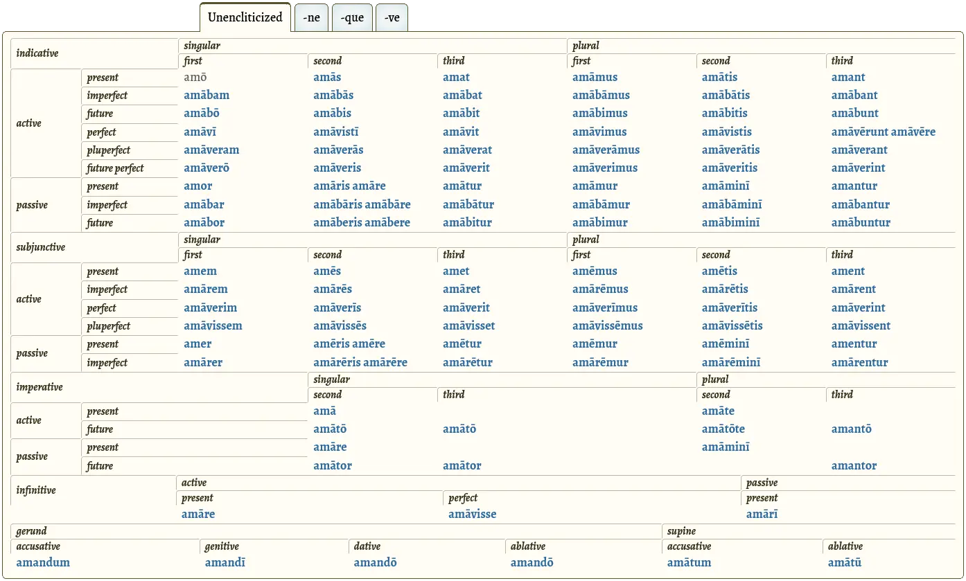
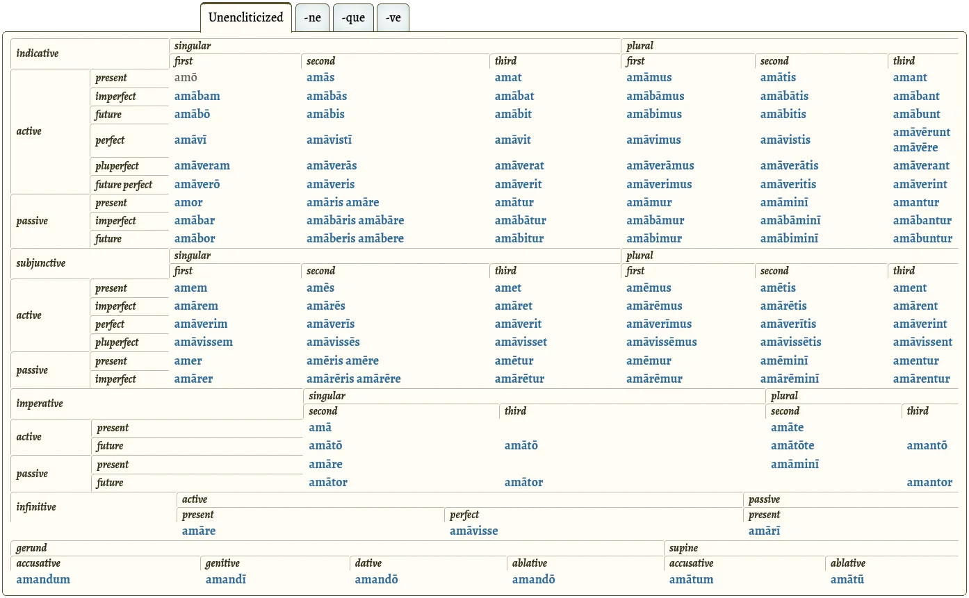
velut has (or is going to have!) a table of inflected forms for each verb, or (to be pedantic) actually five <table> elements one after another.
Each <table> has a header (<thead>) and a body (<tbody>), and the tables contain indicative, subjunctive, imperative, infinitive, and gerund and supine forms, respectively.
The tables are inside a Tabs component that I’ve written about previously on this blog, but I’m digressing again.

If I had done the “table” as one big <table>, all the cells would automatically align.
But because I needed table headers (<thead> elements) in the middle of the table, I had to break it up into the five tables.
This makes more sense semantically, since the <thead> elements are not headers for all the cells under them.
(“Indicative” might be at the top of the table, because the topmost rows are for indicative forms, but that doesn’t mean the later forms are indicative — they’re subjunctive, imperative, infinitive, gerund, or supine instead.
Those are separate things, so should be separate tables.
I’ve put the gerunds and supines in the same table, but that’s not important — it’s more convenient for the layout and it’s fine because none of the cells are headed by header cells that shouldn’t apply to them.)
However, I still wanted cells in three of the tables to be aligned with each other.
(The bottom two tables are for the “non-finite” verb forms — infinitive, gerund, supine — and they don’t have any of the same columns.)
Since the three tables have eight columns, I added eight <col> elements to each of the three tables, and set a width on each <col> using CSS.
The HTML looks like this, for the start of each of those tables. (I use JSX in the source code, but this is the equivalent HTML.)
      <table>
        <colgroup>
          <col class="column-1" />
          <col class="column-2" />
          <col class="column-3" />
          <col class="column-4" />
          <col class="column-5" />
          <col class="column-6" />
          <col class="column-7" />
          <col class="column-8" />
        </colgroup>
        <thead>
					...
To be fair, I didn’t need the class-names.
To target individual <col>s in CSS, I could use a selector other than the class-name, such as :nth-of-type().
But if I were to break the <colgroup> up, which may or may not be helpful in the future, the class-names would mean that I could keep targeting them individually in CSS without changing the CSS.
      <table>
        <colgroup>
          <col class="column-1" />
          <col class="column-2" />
        </colgroup>
        <colgroup>
          <col class="column-3" />
          <col class="column-4" />
          <col class="column-5" />
        </colgroup>
        <colgroup>
          <col class="column-6" />
          <col class="column-7" />
          <col class="column-8" />
        </colgroup>
        <thead>
					...
And here’s some (very exciting) CSS:
.verbFormsTable col {
	width: 10%;
}
.verbFormsTable col.column-1 {
	width: 5%;
}
.verbFormsTable col.column-2 {
	width: 7.5%;
}
The width declaration is more of a suggestion to the browser than an absolute rule, which results in some columns still being different widths in different tables, at least at some screen-widths.
But I think this is a feature, not a bug.
Given the choice of either fitting all the verb forms on the screen (without horizontal scrolling if possible), or all cells being perfectly aligned, I’d prefer to see all the forms.
Theoretically I could insert some hidden content into all the columns, thereby ensuring that columns have the same amount of content and therefore will be given the same width.
That would also have the benefit of obviating the need for <col>/<colgroup> elements.
(But that idea feels messier and hackier than what I’m doing.)
Or I could simply set a width to every individual cell (or at least a cell, that only spans one column, in every column in each table).
(But I like how the browser can give more width to columns that have more content.)
It looks good as it is.
Extra note about column widths
If the width attributes on the <col> elements sum to more than 100%, the table might still have 100% width, but the rightmost column (or columns) might look disproportionately skinny.
The browser seems to try to honour width on each column in turn until it would take the overall width past 100%, then it adjusts the widths so no column is narrower than its content.
Below is the result if the eight columns (at least for the top three tables) have widths specified as 8.75%, 8.75%, 15%, 21.875%, 15%, 15%, 15%, 15% (which sum to 114.375%). These specifications are too rigid and the rightmost column is too narrow.

In my improved code, the eight columns (at least for the top three tables) have widths specified as 5%, 7.5%, 10%, 10%, 10%, 10%, 10%, 10% (which sum to only 72.5%). You saw the CSS for that earlier.

Because the widths come to less than 100%, the browser will distribute the extra space to the columns as it sees fit.
The lower the total, the more flexibility the browser has in widening or narrowing the columns.
This allows a good balance to be struck between columns being flexible enough to expand to fit their content, and column widths being close enough to the values I specify (and therefore consistent across the three tables).
CSS and browsers are col like that, I mean, they’re cool like that.